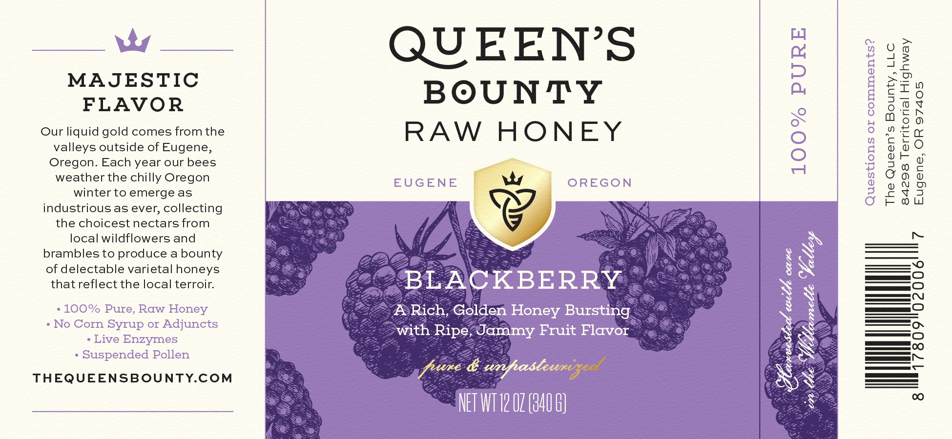
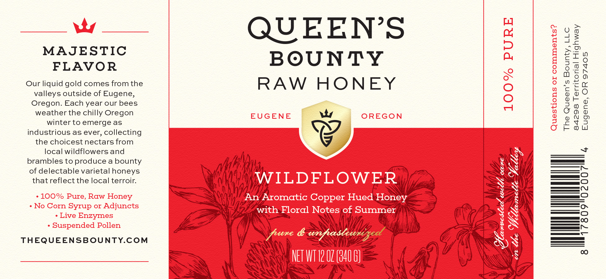
HH started by refining the brand’s existing logo and icon, creating custom lettering inspired by the client's penchant for fables and mythology. Crowns, laurels and seals provide a regal touch and play to the brand's namesake.


With the identity established, we then created a packaging system that would capture the majestic and sophisticated personality of Queen's Bounty. Gold foil shields, botanical illustrations and fountain pen styles overlay a clean canvas to give the label a quiet elegance. The tall, narrow glass jars also give the honey a unique stature on shelves.


Vivid color fields — uncommon within the category — were also used to set Queen's Bounty apart from other honeys. The wraparound label also provides space for the story behind this pure, unpasteurized liquid gold.